CDC data shows deaths in the US have exploded
Join our free email list here.

There have been reports from the insurance industry that deaths in the US have increased a lot. In this post I look at mortality data from the WONDER database, which is produced from death certificates by the National Center for Health Statistics (NCHS) at the Centers for Disease Control and Prevention (CDC). I don’t know how reliable this data is—I’m just showing you what’s there.
The CDC’s mortality data shows there was a dramatic increase in US deaths that began in mid-2020, in the midst of lockdowns and mask mandates. Before the COVID19 panic was introduced in January 2020, and for the next couple months, deaths were at normal levels typical of the season. Deaths escalated with the introduction of COVID19 vaccines in mid-December 2020, and peaked in January 2021 and January 2022 at unprecedented highs.
The CDC still has not finalized last year’s numbers, so all the death numbers from January 2021 forward are provisional, and are expected to increase. I didn’t used any mortality data for the last 6 months, because it will most likely change a lot before it’s finalized, and therefore might tend to be misleading.
Overview of US population and deaths
Chart 1. See Note 1 for the source of this data.
To get a general overview of the situation, I ran a report of historical yearly US population and deaths. The results showed a gradual increase in both population and deaths from 1999 to 2019—followed by a startling increase in deaths in 2020 and 2021, shown in Chart 1. (1)
Monthly breakdown
Chart 2 shows monthly US deaths from 1999 thru 2019. Notice the remarkably consistent scalloped pattern, in which each January (marked by lighter columns) usually has the highest number of deaths, and fewer deaths occur in summer than winter. (2)
Chart 2. See Note 2 for the source of this data.
This pattern of seasonal death deserves a post of its own, or many—I’m just noting it here because this very stable pattern was totally disrupted in 2020, shown in Chart 3, with a very uncharacteristic increase in deaths in April and May. The pattern was basically restored in 2021, although with more deaths than usual.
Chart 3. See Note 2 for the source of this data.
Chart 4 zooms in on the period 2017-2022. Notice that when the World Health Organization (WHO) announced the existence of a scary SARS-COV-2 virus in January 2020, there had not been an unusual number of deaths in the US. Mortality was also not unusual in February and March—there was a modest uptick in March, but that’s typical of most years, probably because February is a short month.
Chart 4. See Note 2 for the source of this data.
The changes really started in April 2020, with an uncharacteristic jump in deaths—usually deaths decline in April, as the summer death lull approaches. What was going on at that time?
According to Yale Medicine’s COVID19 Timeline, in March-April 2020, “THE WORLD SHUTS DOWN”:
Credit: Maya Szata, COVID19 Timeline.
“Countries seal borders; sports teams cancel season; schools close and employees go home. People start wearing masks and ‘social distancing.’”
So, before the world shut down, there was no discernible change in US deaths, compared to normal; after the world shut down to escape the dangerous virus, deaths dramatically increased—why? As you’ll see below, the increase was mostly in deaths of senior citizens, so the stories of seniors in care homes being neglected and terrorized when the pandemic started come to mind as an important factor.
Deaths by age group
Most deaths occurred in people 65 and older, and after that, 45 and older, although all age groups 15 and older experienced some increase in deaths over the last 2 years. The difference in deaths between older and younger is so vast, I combined 2 different charts to illustrate the numbers; the bar chart at the top of Chart 5 helps keep the numbers in perspective. Chart 5 shows the number of deaths in the various age groups between January 2018 and March 2022 (2 years before and 2+ years after the announcement of a SARS-COV-2 virus threat in January 2020). (3)
Chart 5. See Note 3 for the source of this data.
This might be chart overkill, but I made a separate chart for each age group, with a trend line, to see as much detail as possible. Deaths in the 0-4 age group actually declined from 2018 to 2022, which could be due to declining births.
Possible explanations
The CDC’s mortality data shows deaths have increased dramatically over the last 2 years, and were at their highest points ever in history in January 2021 and January 2022. You don’t have to be a statistician, or even know anything about statistics at all, to intuitively understand visually, by looking at the charts I’ve shown here, that something happened to cause a disruption in the usual pattern of deaths—a pattern that has been remarkably stable for at least the last 20 years.
Diehard believers in the official COVID19 narrative will say the increase in deaths was due to COVID19—that computer modeling programs successfully predicted a deadly pandemic from a dangerous virus before it occurred, and had we not shut down and worn masks, and gotten vaccines, the death toll would have been higher. It’s purely magical thinking, since there’s no real evidence to support this belief—although the mortality data doesn’t preclude it.
The mortality data also doesn’t preclude the possibility that initially, lockdowns, masking, and sheer terror resulted in a sizable increase in deaths, especially among the elderly, and that toxic vaccines later caused deaths to escalate, acting as an ongoing killing instrument.
There was a pretty dramatic leap in deaths in the month COVID19 vaccination began, and in the following month. With the limited information here, it’s not possible to tell whether those events are related—but it would help explain the massive increase in deaths reported to the Vaccine Adverse Event Reporting System (VAERS) from COVID19 vaccines. There was also a sizeable decline in deaths a few months after vaccination started, but it looks like the usual summer lull in deaths that has occurred for the last 20 years (except 2020).
Another possibility is that COVID19 was created as cover for deaths caused by something else altogether, like the 5G rollout. Or maybe the Gates Empire is testing a new way to block out the sun, further depriving us of Vitamin D and photons. Maybe they are secretly testing a toxic new aerosol vaccine, to eliminate the inconvenience of informed consent. How about covert testing of an amazing new pesticide of questionable safety? When the agenda is controlled by psychopaths, the possibilities are endless.
***
NOTES:
1) US population and deaths by year. For provisional data for 2021, see Note 2.


2) US deaths by month.

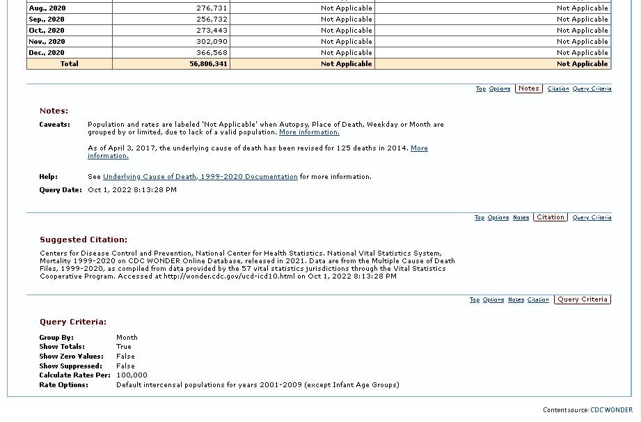
Cite for finalized data.


Cite and results for provisional data.
3) US deaths by age group and month.

Cite for finalized and provisional data.