All-cause deaths in England: vaccinated versus unvaccinated
Join our free email list here.

The official vaccine narrative goes like this: All vaccines are safe and effective and save lives, and anyone who questions it is an idiot.
I’m surprised the Centers for Disease Control (CDC) doesn’t have a monument to that effect on their front lawn. They might want to set it in stone now, while they still can, because the vaccine industry seems to be heading the way of the mercury-based cough medicine industry.
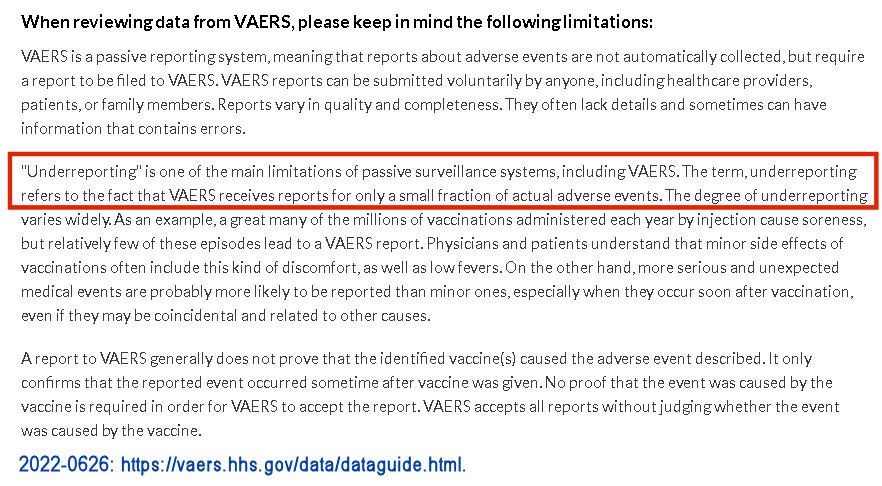
COVID19 vaccines, which were developed and marketed to the public within a mere year, are causing people to take another look at other vaccines. It’s not that other vaccines haven’t always looked bad—it’s that no one really noticed, since only a small fraction of vaccine injuries are ever reported (1).

See the CVax Risk page for the source of this data.
But the number of vaccine injuries reported from COVID19 vaccines was so massive, it couldn’t be swept under the rug—three times the number of deaths have been reported from COVID19 vaccines in the last 2 years than from all other vaccines combined for the last 31 years. No one in government or mainstream media is talking about it, as if it doesn’t matter. It’s deeply creepy.
The risk is one in a million—come get ‘em!
I saw a video the other day of a panel of pro-vax experts bemoaning the fact that parents are starting to question the usual line-up of childhood vaccines, just because they think the COVID19 vaccines are dangerous. God help the pharmaceutical industry. If you’re heavily invested in the vaccine arm, you may want to sell your stocks ASAP, like a year ago.
What the learned experts didn’t mention is that the CDC’s recommended childhood vaccine schedule includes a bare minimum of 50 doses of 12 vaccines from age 0-18.
One expert said these vaccines are so safe, the risk is “one in a million.” This “one in a million” con is long-running, and I wrote a paper about it in 2018. It sounds like it means the vaccines are very safe, but it doesn’t. Even if the risk per vaccine dose were 1 in a million (it’s actually far higher) the risk would still be 50 in a million, which is 1 in 20,000, because the schedule includes 50 vaccine doses. But there is much more to this story at the link.
Statistical funny business across the pond
This paper looks at all-cause deaths in England, comparing deaths among the COVID19 vaccinated to the unvaccinated. The data, which runs from January 2021 through May 2022, was collected by the Office for National Statistics (ONS) and is available at this link.
The database has a lot of different categories of vaccinated, depending on the number doses and how long ago they were received (see Note 2). I only used the “Ever vaccinated” category, which adds all the other vaccinated categories together, and the “Unvaccinated” category. “Ever vaccinated” includes any deceased who received any number of COVID19 vaccines at any time.
I couldn’t find any detailed information about how this data was gathered, and I don’t know if England has a central database that tracks everyone’s vaccination status. If they don’t, deaths where vaccination status can’t be verified were probably lumped into the “unvaccinated” category, as they are in the US, which artificially inflates the number. But I don’t think that’s the main concern with the ONS calculations of mortality rate.
I recently wrote about the US database that tracks vaccination status in ‘COVID19 deaths,’ which is manage by the CDC (the US does not provide data for all-cause deaths by vaccination status). These databases share a similar serious issue: “adjustments” or “standardization” of data that change the results—by a lot.
“Age adjustments” in the US make vaccination look better

See Note 1 at this link for the source of this data.
In the US, the CDC provides 2 choices for the incidence rate (IR) of deaths per 100,000 people—the “crude” and the “age-adjusted” IR. The crude IR per 100,000 is a simple calculation, dividing the number of deaths by the size of the population involved, and multiplying by 100,000. The age-adjusted IR applies other mathematical adjustments to the population, depending on the age group and their probability of death.
Without knowing specifics, we can’t gauge the legitimacy of these adjustments. We are apparently supposed to assume the age adjustments were legitimate, and resulted in a more reliable result than the “crude” or raw calculations—but did they? The age adjustments invariably made vaccination look dramatically better, as illustrated in the chart above. The improvements in favor of vaccination as the result of adjustments were even more dramatic in England, as you’ll see below.
Commonsense suggests that objective adjustments would not favor one group or the other all the time. I previously wrote about this issue here. Maybe there is some legitimate basis for it, and maybe it even ‘means something,’ but the details of how these age-adjustments were calculated should be publicly available, and as far as I can tell, they are not.
The same issue in England—except it’s called “age-standardization” and it’s on steroids
In England, the IR is called the Mortality Rate (MR), and the database provides only 1 choice—the “age-standardized mortality rate per 100,000 person-years.” This label is apparently intended to ensure that no one has the slightest idea what it means. Try telling someone—anyone—that their risk of death is 1500 per 100,000 person-years, and watch their face go blank.
When I calculated the “crude” or raw MR per 100,000 person-years using the ONS data (See Notes 3 & 4), it turned out the England database had the same issue as the US database, but on steroids—not only did age-standardization always make vaccination look better, it was so dramatic, it completely changed the results—from results that showed the vaccinated had a much higher death rate, to results that showed the unvaccinated had a higher death rate. What?!

See Note 4 for the source of this data and a data table.
In this chart, the vaccinated group is shown in violet—the raw MR is shown with a solid line, and the age-standardized MR is shown by the dotted line. The unvaccinated group is shown in aqua.
As you can see, if you use the raw mortality rate, the MR for the vaccinated group is more than double the MR for the unvaccinated group.
But after the age-standardizations are applied, the unvaccinated group had a higher MR—high enough to place it above the age-standardized MR for the vaccinated. Whew! Thank goodness for those age-standardizations! It was starting to look like COVID19 vaccination increased the risk of death, which can’t be, because we know that all vaccines are safe and effective and save lives, and anyone who questions it is an idiot.
To make this point clearer, I divided raw and age-standardized mortality rates for England into separate charts. These 2 charts each create an entirely different impression of the impact of COVID19 vaccination status on death rates—the raw MR makes vaccination look bad, and the age-standardized MR makes vaccination look good.

See Note 4 for the source of this data.
We need to see the criteria and formulas for the age-standardizations that were applied, to verify their legitimacy, but again, as with the US data, I can’t find this information.
Final thoughts
Do England’s “age-standardizations” and the US’s “age-adjustments,” both of which invariably make vaccination look better, really make the data more reliable, or is statistical shenanigans involved, to achieve a desired result?
Age adjustments in statistics have been around a long time and are an accepted practice. But that doesn’t mean the specific age adjustments used by the CDC and the ONS were legitimate. To determine that, we need more information, such as what age groups they used, the expected death rate they assigned to each, the formulas they used, etc. I suspect shenanigans, just based on how the adjustments uniformly made vaccination look so much better—and in the case of England, completely reformed the result from “vaccination bad” to “vaccination good.” Maybe someone can prove me wrong. If you think I’ve made any errors here, let me know in comments.
***
NOTES
1) The VAERS website confirms that only a “small fraction” of vaccine injuries are reported.
2) Categories in the ONS vaxed/unvaxed database:
Unvaccinated
First dose, less than 21 days ago
First dose, at least 21 days ago
Second dose, less than 21 days ago
Second dose, between 21 days and 6 months ago
Second dose, at least 6 months ago
Third dose or booster, less than 21 days ago
Third dose or booster, at least 21 days ago
Ever vaccinated (any COVID19 vaccines at any time)
3) “Person years” has been described like this:
“Person years and person months are types of measurement that take into account both the number of people in the study and the amount of time each person spends in the study. For example, a study that follows 1,000 people for one year would contain 1,000 person years of data. A study that follows 100 people for 10 years would also contain 1,000 person years of data.”
Calculating the “crude” mortality rate from person-years (as opposed to persons, as in the US), is done the same way—by dividing the number of deaths by the number of person-years:
“Person-time incidence rates, which are also known as incidence density rates, are determined by taking the total number of new cases of an event and dividing that by the sum of the person-time of the at-risk population.”
4) Data table for mortality rate in England—COVID19 vaccinated compared to unvaccinated. Data is available for download here.
