Have US deaths been fabricated?
Join our free email list here.

Although doubts about the integrity of government databases are common, for obvious reasons, I seldom see anyone try to make a case for false data, with evidence. I came across one such attempt recently, concerning the US database of deaths in WONDER, and I’m going to review the evidence here. This review involved some very strange surprises.
The claim (here and here) was that in late 2020 — early 2021, the Centers for Disease Control (CDC) added about 400,000 (fake) 2020 deaths to their records for 2020; before the addition of those deaths, mortality in 2020 was on track to be about the same as 2019. The reason for doing this was said to be to disguise a large number of COVID19 vaccine-related deaths that were expected to occur in the near future.
The retroactive bulk addition of deaths seemed unlikely to me, purely for practical reasons—WONDER is a public database, which means thousands of people, both inside and outside of government, use it daily, sometimes saving results, and integrating them in their own work. If the historical numbers suddenly changed dramatically, a tremendous number of people would notice, and ask questions.
On the other hand, maybe a lot of people did notice and ask questions, and we just never heard about it. Also, death numbers in WONDER are “provisional” for a year or more, meaning they are expected to increase before they are finalized. It may be possible to add additional deaths gradually, without attracting much attention. I’m not sure if adding 400,000 deaths over 2 months would be gradual enough, but for the sake of discussion, I’m just going to assume it was doable.

The evidence
Two pieces of evidence of this fraud were offered. One was an image, shown here, said to be a CDC estimate of anticipated 2020 deaths, based on data available through September 2020. This projection showed 2020 deaths were expected to be slightly lower than 2019. But I couldn’t find any information about the source of this data, other than “CDC”, so I don’t know what to make of it.
The other piece of evidence was a paper published in the Johns Hopkins News-Letter in November 2020, called A closer look at US deaths due to COVID-19, by Yanni Gu. The article was about a webinar presented by Genevieve Briand, assistant program director of the Applied Economics masters degree program at Johns Hopkins.
Briand contended that deaths in 2020 were typical of expected numbers. Briand also contended—correctly, I’m sure—that a lot of “COVID19 deaths” were just a reclassification of other kinds of deaths, such as from pneumonia or heart attack. Basically, they can be any kind of death, as long as “COVID19” can be tacked on as “verified or presumed.” I have no doubt that happened, and continues to happen, but I won’t be addressing that aspect of the Gu paper here, only the issue of all-cause deaths.

This retracted paper turned out to be propaganda—along with the retraction!
The Gu paper was retracted not long after it was published, which the News-Letter justified at this link.
The retraction was written in contemporary Song-and-Dance, and said: “…it was brought to our attention that our coverage of Genevieve Briand’s presentation ‘COVID-19 Deaths: A Look at U.S. Data’ has been used to support dangerous inaccuracies that minimize the impact of the pandemic. We decided on Nov. 26 to retract this article to stop the spread of misinformation…”
Given the sketchiness of publishing in general, particularly when anything medical is involved, I always take retractions with a grain of salt. That’s especially true when the retraction is accompanied by the battle cry of the Indoctrination Army:
“We’re here to stop the spread of misinformation!”

So, when I looked closer at the Gu paper, I was admittedly a little surprised to find it was actually propaganda—it distorted, twisted, and lied about facts to promote an agenda—more on that later. But it wasn’t retracted for that—and the retraction itself was also propaganda. Propaganda retracting propaganda? That was a new concept for me—although I understand now it has probably happened many times before, and I just didn’t notice.
Essentially, the retraction becomes another layer of propaganda, to further muddy the waters. The retracted article circulates in alternative media, fueled by the outrage of censorship, spreading propaganda sprinkled with truth. At the same time, the retraction circulates in mainstream media and academia with propaganda and a pinch of truth, fueled by outrage about misinformation from COVID-deniers and antivaxers.
Meanwhile, everyone is being played, and no is looking for the SOMETHING ELSE that has killed so many people over the last few years.
Did the number of 2020 deaths change?

Chart 4. See the CVax Risk page for the source of this data.
The Gu paper contained hardly any data about the number of deaths—most of it was about death percentages, an entirely different subject.
The percentage of deaths attributable to each age group is very consistent from year-to-year, as you can see in Chart 4. It doesn’t actually show the percentages, but the colored blocks show the portion of deaths attributable to each age group from 2015 through 2022. These percentages can potentially remain the same in spite of huge increases in death numbers.
However, the Gu paper did give a death total:
(1) “From mid-March to mid-September, U.S. total deaths have reached 1.7 million…”
I compared the number “1.7 million” to the number of deaths shown in WONDER now for that period. Deaths from “mid-March to mid-September” are shown in Table 1 for the years 2020, 2019 and 2018. (Weekly death numbers aren’t available in WONDER prior to 2018.) The week with the highest number of deaths each year is highlighted in red.

Table 1. See Note 1 for the source of this data.
From Week 11 ending March 14, 2020, through Week 37 ending September 12, 2020, there were 1.7 million deaths (1,719,429). If you measure instead from Week 12 through Week 38, there were also 1.7 million deaths (1,720,519). Adding additional weeks to this estimate would add about 60,000 deaths per week.
I assume there are somewhat more deaths in WONDER now than there were in November 2020, since the 2020 numbers weren’t finalized until late 2021 or early 2022. Plus, mortality numbers can increase quite a bit for the first few months. We don’t have Briand’s exact numbers, but based on the information available, deaths for the period mid-March to mid-September 2020 were about the same in November 2020 as they were in May 2023 — 1.7 million. Therefore, a large number of deaths were not added to WONDER in the interim.
The Gu paper then waded gently into the fact-twisting waters:
(2) “Surprisingly, the deaths of older people stayed the same before and after COVID-19. Since COVID-19 mainly affects the elderly, experts expected an increase in the percentage of deaths in older age groups. However, this increase is not seen from the CDC data. In fact, the percentages of deaths among all age groups remain relatively the same.”
Notice the first line in this paragraph says deaths of older people stayed the same (which is false, if it’s referring to the number of deaths), while the rest of the paragraph talks about the percentage of deaths staying the same (which is basically true).

The number and percentage of deaths in each age group are entirely different concepts, with different answers—so why were they lumped together in the same paragraph? It was either poorly worded (unlikely in a published paper); or it was cleverly worded, to convey the impression that both the number of deaths and the percentage of deaths were normal in 2020. Based on what I found in the rest of the paper, I’m voting for the second option.
Also, the language seems deliberately structured so as to avoid the subject of increased deaths among younger people. Since “COVID-19 mainly affects the elderly,” why did deaths among younger people increase? There are so few deaths in younger people compared to older, it would take a monumental increase to alter the percentages—is that why Briand and Gu focused on the percentages instead of the actual numbers? You can see the excess death numbers by age group here.
The chart below shows US deaths from 2015-2023 by age group, with the total for all age groups at the top. Note the increase in deaths in all adult age groups starting around April 2020, which is marked with the first black dot. I haven’t calculated the before-and-after percentages of deaths attributable to each age group, but they look similar, and I’m just going to give Gu and Briand the benefit of the doubt for now, that the percentage of deaths in each age group remained “relatively the same.”

Chart 1. See the CVax Risk page for the source of this data.
Finally, Gu threw caution to the wind with a blast of blatant disinformation, which he credited to Briand:
(3) “Briand also noted that 50,000 to 70,000 deaths are seen both before and after COVID-19, indicating that this number of deaths was normal long before COVID-19 emerged. Therefore, according to Briand, not only has COVID-19 had no effect on the percentage of deaths of older people, but it has also not increased the total number of deaths.”
Here we’re told in no uncertain terms that the number of deaths in 2020 did not increase—although it’s unclear whether this was intended to apply to everyone, or only to “older people.” In either case, it’s false. No data was provided to back up this claim—presumably because there is none, because WONDER data shows the number of deaths in 2020 did increase, a lot, for adults of all ages.

Chart 2. See Note 1 for the source of this data. Table 1 above is the data table.
Chart 2 compares deaths from March to September in 2020 (in orange), with 2018 and 2019 (in gray). This chart illustrates the data in Table 1 above.
Keep in mind that prior to 2020, deaths had been gradually increasing since 1999 (shown in Chart 3), and 2019 had the highest number of deaths on record for the last 2 decades.

Chart 3. See Note 2 for the source of this data.
***
POP MINI-QUIZ: Does Chart 2 show that deaths in 2020 didn’t increase?

Chart 4. If a low number of deaths in 2020 suits your agenda better, simply turn Chart 2 upside-down.
IMPORTANT NOTE — please read! This pop mini-quiz is only suitable for statisticians and scientists. If you aren’t a statistician or scientist, please allow me to answer for you, because although I’m neither a statistician nor a scientist, I do slightly resemble one, in that I sometimes turn data into cool charts and tables.
ANSWER: Yes, Chart 2 indicates that deaths didn’t increase in 2020— as long as you look at it upside-down, as shown in Chart 4.
***

Table 2. See Note1 for the source of this data.
Continuing with the analysis of statement (3), Gu said “50,000 to 70,000 deaths are seen both before and after COVID-19” — was that true?
In Table 1 above, we saw the number of deaths each week in 2018-2020, from mid-March to mid-September. While several weeks in 2020 had over 70,000 deaths, the highest number in 2018-2019 was just under 58,000. So, where had the “50,000 to 70,000 deaths” Gu mentioned been “seen” prior to COVID19?
Table 2, a very long table, shows the number of deaths each week from 2018-2020; the weeks with 60,000 or more deaths are highlighted in yellow, and the weeks with 70,000 or more deaths are highlighted in red. Again, weekly deaths are not available prior to 2018.
There were no weeks in 2018 or 2019 with 70,000 or more deaths—the first week with more than 70,000 deaths was Week 14 of 2020. There were 5 weeks in 2018 with 60,000 or more deaths, with the highest being 67,497—all in winter, when deaths are historically highest. There were no weeks with 60,000 or more deaths in 2019.
In other words, the only time 70,000 deaths in a week had been “seen” when the Gu paper was written was in 2020—the year deaths supposedly didn’t increase.
Conclusions
Database contents are a matter of fact, not opinion
First, an important point about something obvious—but an obvious point people often seem to ignore: Counting data in a database is a matter of fact, not opinion. You can question the integrity and accuracy of the data all you want, and you can debate what the data means all you want, but when it comes to determining what data is in the database, opinions and beliefs don’t matter.
For example, the question of whether 70,000 deaths a week ever occurred prior to 2020 in the WONDER database, or whether the number of deaths increased for any age group, is a question of fact, and the correct answer can be determined with absolute certainty.
The problem is, most people aren’t going to access WONDER—they’re going to rely on the people reporting on it to know what’s in there, and be honest about it. Anyone who doesn’t access WONDER on a regular basis would have no way of knowing the information between the lines that I’ve provided here.
Were Gu and Briand looking at some special secret database the rest of us don’t have access to—a database where 70,000 deaths in a week was “normal,” and deaths in 2020 didn’t increase? I suppose I can’t totally eliminate that possibility, since I don’t think “WONDER” was ever mentioned by name. I just assumed they didn’t want to tip people off about where to verify the data.
Deaths were not added to WONDER in bulk
The claim investigated here was that 400,000 deaths for the year 2020 were added to WONDER in late 2020 or early 2021. We saw that deaths for the period mid-March to mid-September 2020 were about the same in November 2020 as they were in May 2023 — 1.7 million. Therefore, a large number of deaths for the year 2020 weren’t added to WONDER in the interim.
Organic or orchestrated?
Imagine you are a diligent graduate student or academic at a prestigious university, and you want to get something published in the school newsletter. You think the COVID19 pandemic was way overblown, or even faked, and you decide to write about it. You know it will be controversial, but you’re a rebel. So you fire up WONDER and look into the mortality data…but you’re surprised to find there have been a lot more deaths than usual after all. Do you:
Choose another topic to write about;
Write about the increase in deaths, and try to explain it consistent with your hypothesis;
Juggle the numbers and cleverly construct sentences to trick people into thinking deaths didn’t increase; then cross your fingers and hope no one notices.
Seriously, no one would choose Option 3. Anyone who would choose Option 3 is too clueless even for academia.
That leaves just one possibility—this paper was an operation of some kind. A tiny operation for sure—just another speck of scum in the COVID19 psy-op sludge pool, but an operation nonetheless.
That said, the Gu paper shouldn’t have been retracted—it should have been torn apart piece-by-piece in the public square, run through the wringer, and hung out to dry in online forums everywhere as an example of the sorry state of academia.
Instead, what are we left with?
If you are ‘mainstream,’ you’re left with a paper that was retracted because it tricked people into believing The Deadly Virus wasn’t all that deadly. If you want the details, just consult FactCheck or Snopes.
If you are ‘alternative,’ you’re left with a paper that was retracted to censor The Truth—that The Deadly Virus wasn’t all that deadly. If you want the details, just consult some of the 254,000 truthish content channels on BitChute or YouTube.
Notice how nothing we are left with has anything to do with reality? It’s all about a deadly virus that doesn’t even exist.
Meanwhile, no one is talking about the SOMETHING ELSE that has killed so many people over the last few years.
***
NOTES
TIP: To run a saved WONDER search, click the link and agree to the terms of service. If the search does not run automatically, click the Send button.
1) For weekly deaths from 2018 - 2023, run this search. Citation is below.

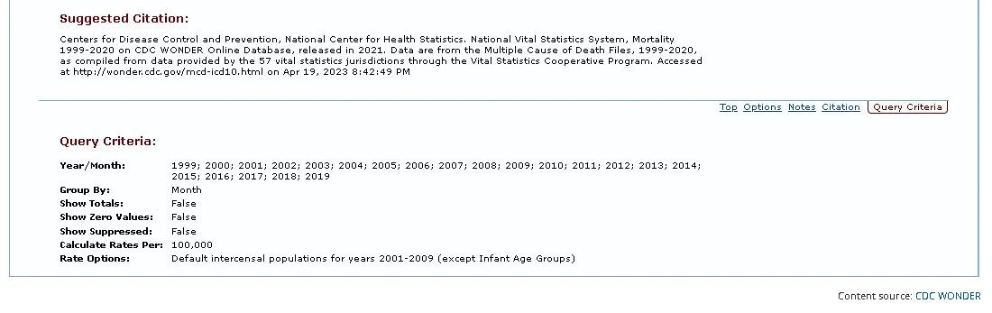
2) For monthly US deaths from 1999-2019, run this search. Citation is below.