From speculation to correlation to cause: the logical path to proof (and why no one is following it)
ADDITIONAL READING: For more on US mortality, see this article. You may also want to consider purchasing my reference book, The Illustrated US Mortality Guide, which makes it easy to understand decades of mortality data in minutes.
What really happened in 2020?
When deaths in the United States skyrocketed starting in Spring 2020, many people didn’t know about it, including me, at the time. “Deaths were normal in 2020” continues to be one of the most common responses I get, when I post US mortality data in an alternative media forum—demonstrating how effective the US democide coverup has been.

Forum comment from 2024.
Nevertheless, US mortality records show that deaths did skyrocket in 2020 (and 2021), like never before in at least a century, since the Spanish Flu. This is a matter of record, not a matter of opinion.
We are told by mainstream media that any excess deaths in 2020 were caused by a dangerous virus called SARS-CoV-2, which caused a disease called COVID-19. or “Covid.” It seems we are expected to accept this claim on faith—but does the mortality data really support the “Dangerous Virus” narrative? We’ll take a look in this article.
And, what about the two conflicting alternative narratives? First, there is the “Mistakes Were Made” narrative, in which deaths surged, not because of a dangerous virus, but because of harmful Covid response protocols. Second, there is the “Nothing Happened” narrative, in which deaths did not surge in 2020, and Covid was just a hoax or a con.
The mortality data cannot possibly support all 3 of these very different and conflicting narratives about What Really Happened in 2020—and it may not support any of them. In fact, from what I’ve seen, it doesn’t. In this article, we’ll look at some basic mortality data, and see how it fits, or not, with these three narratives about the cause of excess deaths in 2020.
A note on Spanish Flu vaccines
I’ve had many doubts about the official Spanish Flu narrative, especially since discovering the Centers for Disease Control’s (CDC’s) ongoing conspiracy to conceal the existence of Spanish Flu vaccines, which I wrote about in this article.
The CDC has a long history of claiming at every opportunity that there were no Spanish Flu vaccines—and since the CDC is perceived as a top health authority, this claim is often repeated by others, most of whom are simply not aware it is a brazen lie.

A Spanish Flu vaccine waiting line? Don’t forget your masks! The more things change, the more they stay the same.
In fact, as I showed in the article, numerous vaccines that purported to prevent and cure Spanish Flu were marketed and administered to the public. This mass-vaccination campaign was well-documented in a 2010 paper published in the Journal of the Office of the US Surgeon General and the US Public Health Service. All the vaccines were based on the since-discredited theory that a bacteria called Pfeiffer’s bacillus caused the flu. The author wrote:
“These [Spanish Flu] vaccines were widely used. Park’s vaccine was released to the military for use in Army camps as well as to private physicians. It was also used as corporate policy among industrial workers, including the 14,000 employees of the Consolidated Gas Company and 275,000 employees of the U.S. Steel Company. Leary’s vaccine was used frequently during the epidemic in state custodial institutions of the Northeast and by some private physicians. Duval and Harris reported immunizing approximately 5,000 people, most of whom were employees of large New Orleans companies. Almost without exception, those reporting on the use of these Pfeiffer’s bacillus vaccines reported that they were effective in preventing influenza.”
How large increases in death go unnoticed
Because of the enormous size of the US population today, which is 335 million (Note 1), it is simply not possible for the average person to personally detect increases in death, even very large increases like we had in 2020—especially when these increases in death only occurred in limited regions for a limited period of time.

To illustrate that point, in the first death spike in Spring 2020, in the New York City mass casualty event, deaths increased an incredible 100%—550% in 25 counties in the New York City metropolitan area, according to the official records, killing 50,000 more people than usual over 8 weeks. The population of those 25 counties is about 20 million—meaning an extra 1 in 400 people died there in the 8-week spike. While that is undoubtedly a lot of people, it means that even someone with a large circle of 400 friends and family in the NYC metro area would probably detect little or no change in the usual number of deaths among them.
A quick look at the death numbers
Where they come from:
The Centers for Disease Control (CDC) tells us that death records in the US mortality database (known as WONDER) are collected from death certificates issued in counties nationwide. The federal death records should therefore match county death records, and to the best of my knowledge, they do. As far as I know, no one who has compared them has found any inconsistencies.
Everyone who does the same search in the WONDER database will get exactly the same results, every time, because the contents of the database are a matter of record, not a matter of opinion. There can be differences of opinion about the integrity or meaning of the data—but the contents of the database objectively are what they are, regardless of anyone’s opinions about it.

Table 1: US Yearly Deaths 1999—2023. Click the image to go to the article, if you would like live links to the saved searches in the mortality database.
Death changes in 2020:
Table 1 shows yearly US deaths since 1999, and the change and percent change in deaths each year. The higher numbers are highlighted in shades of red, and the lower numbers in shades of blue.
The increase in deaths in 2020 was a stunning 6 times larger than any previous increase since at least the year 2000. Deaths increased by 529,000 in 2020, or 19%, whereas the highest previous increase was just 86,000, or 3%. This was followed by a typical increase of 2% in 2021, then a sharp decline in deaths in 2022 and 2023.
There were 1.3 million more deaths than expected (“excess deaths”) of US citizens in the US during the Covid years (2020—2022), including 487,000 excess deaths in 2020. Excess deaths are deaths over and above the number expected. There are many different ways to estimate excess deaths—you can see the exact numbers I came up with using 4 different common methods, and read about why I chose those methods, in this article demystifying excess deaths.
Chart 1 shows the total number of deaths from all causes recorded in the official records from 1968—2024 (orange line); along with population size (green columns). Compared to the years 1968—2019, deaths in 2020 and 2021 stand out as years of extraordinary mortality. Of all the virus scares we’ve had in recent years, none even made a noticeable blip in deaths compared to 2020 and 2021.

CHART 1. See Note 2 for the source of this data.
Based on the information in Table 1 and Chart 1, how would you describe deaths in 2020 and 2021? Do “extraordinary” or “massive” go too far, or not far enough? Is it reasonable for members of the alt-media who routinely opine about Covid and/or the non-existence of viruses to ignore the stunning mass casualties during the Covid years?
Fake deaths and “data fraud”

Sometimes, people dismiss skyrocketing deaths during the Covid years, especially the 529k increase in 2020 (pre-vaccine) as “fake.” It is often a knee-jerk response from people who have been told over and over again by multiple trusted alt-media sources that deaths were normal in 2020, and they don’t want to believe the death records that show their trusted media sources either had no idea what they were talking about, or they were lying.
As I’ve written about before, the idea that 2020 death records are fake has been manufactured with propaganda from the beginning. I’m sure that, while the idea may have sincere followers among people who’ve never seriously looked into it, the idea of fake death records is definitely an integral part of the democide coverup, as well as the “Nothing Happened” narrative about What Really Happened, which I’ll talk about more in a minute.
If the fake death records claim is true, it would mean we are in the midst of the most massive criminal conspiracy to alter government records in US history—the fabrication of more than a half-million deaths—while all the mainstream and alternative media stands by silently.

Think of the uproar we would normally expect over a claim that 529,000 deaths were faked—considering the collective hissy fit that ensues every time someone mentions the fake shooting deaths of 26 people at a Connecticut school in 2012.
Think of the uproar we would normally expect over a claim that 529,000 deaths were faked—considering the collective hissy fit that ensues every time someone mentions the fake shooting deaths of 26 people at a Connecticut school in 2012.
Maybe that’s why these days, most alt-media figures tend to avoid the seemingly outrageous claim that over a half-million deaths in 2020 are fake, in favor of much vaguer and ambiguous claims of “data fraud” or the like. This ambiguity facilitates the democide coverup by suggesting that deaths were not really as high in 2020 as the records show, and that the records cannot be trusted. And, because “data fraud” is invariably undefined, it is a useful scapegoat—any mortality data that is inconsistent with the narrative about cause being promoted can be attributed to unspecified “data fraud.”
Ed Roland of Collective Soul mentions contagion in the classic song “December.”
Yes, there probably was data fraud related to Covid funding, such as attributing deaths to “Covid” for financial reasons, when arguably they should not be. But that doesn’t explain the huge increase in deaths from all causes, so it’s a red herring—not even a clever one. The key issue is, what caused the number of deaths in the US to skyrocket in 2020 and 2021?
From speculation to correlation to cause
A serious investigation seeking true answers about cause would probably start with a search for correlations—that is, things that vary together in some way. For example, a researcher in this case might want to see if deaths increased or decreased when the use of Covid medical response protocols such as ventilators were started or stopped or modified. In this example, deaths and ventilator use are both “variables.”
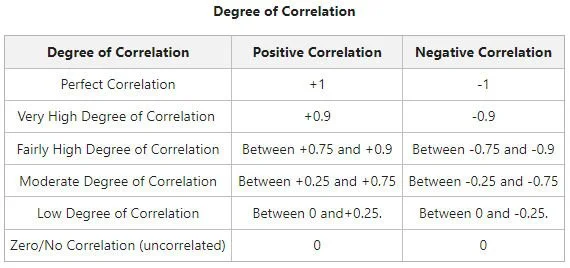
Degree of correlation chart (missing source).
Correlation is a way to measure how much 2 (or more) variables vary together. They are positively correlated if they both tend to increase or decrease at the same time; and they are negatively correlated if one tends to decrease while the other increases, or vice-versa.
The correlation between 2 variables can be any strength from weak to strong—the Degree of Correlation Chart posted here gives a general idea of how the strength of correlations can be interpreted.
The reason why identifying correlations is a usual starting point for investigation is that causation always includes correlation. If there is no correlation between variables, it means that neither can be affecting the other, so the possibility of causation is completely eliminated. For example, if the researcher finds that deaths have no correlation with the use of ventilators, then ventilators could not be a main cause of excess deaths.

Correlation may indicate causation, but doesn’t necessarily.
On the other hand, finding a correlation between two variables may indicate causation, but doesn’t necessarily. If a researcher finds that the use of ventilators is positively correlated with deaths, that does not necessarily mean the ventilators caused the deaths—it could simply mean there were more sick people seeking treatment, and therefore, more deaths. Usually, no conclusions can be drawn from correlations alone—they are just a piece of the puzzle for understanding what is going on, and guiding the direction of research.
The problem is, most people in the media promoting one or another of the 3 narratives designed to control public opinion about excess deaths haven’t gotten as far as looking at correlations—they are stuck at pure speculation, with ideas guided only by rudimentary mortality data, if any, such as the yearly death totals we saw in Table 1 and Chart 1.
Is it correlation, or just speculation?
With only yearly US death totals to consider, there are virtually unlimited possibilities when it comes to speculation about the cause, because nearly anything capable of causing death qualifies.
I see a lot of reasoning that basically goes like this:
“Ventilators (or other cause) can be dangerous; they were used in response to Covid in 2020, when deaths skyrocketed; therefore, ventilators (or other cause) were probably a significant cause of skyrocketing deaths.”

Just substitute “ventilators” with “Remdesivir” or “lockdowns” or “refusal of antibiotics” or “fentanyl,” or “stress,” or a long list of things, as desired. What all these claims have in common is, they are all pure speculation, based on very limited mortality data.
I’m not saying these claims are necessarily false—I’m saying detailed mortality data is freely available, and we need to see if deaths are correlated with the particular cause suspected of causing excess deaths. Did deaths increase or decrease when the use of ventilators (or other suspected cause) increased or decreased? This is a fundamental question for establishing the viability of any theory about the cause of excess deaths, but I rarely see anyone address it.
“But wait,” you might be thinking, “if deaths increased in 2020, and so did the use of ventilators (or other suspected cause), that means deaths are positively correlated with ventilators (or other suspected cause), right?”
Sort of, in that it makes sense to consider it when speculating about possible causes—but yearly death totals do not provide nearly enough information to correlate deaths with anything, in this situation. Deaths did not simply increase in 2020 across the board—what happened was a series of localized death waves, in which deaths surged, peaked, and then declined back to near normal in a bell-curve-like pattern in different areas of the US. That paints an entirely different picture of what happened than a simple overall increase in deaths.
A deeper look at the mortality data
In order to look for possible correlations, we have to go a little deeper into the mortality data than simple yearly death totals, such as looking at weekly deaths. Chart 2 shows weekly US deaths in 2020 (in blue columns) compared to weekly deaths in 2019 (in tan columns). Deaths in 2019 were relatively normal, compared to historical numbers, and were slightly higher than 2018.
The pattern of 2019 deaths, in which they gradually increased in winter and decreased in summer, was the norm for decades, until 2020, when everything went wonky for a couple of years.

Chart 2: United States Weekly Deaths, 2020 compared to 2019. See Note 3 for the source of this data.
With this more detailed weekly mortality data, an investigator could attempt to correlate increases and decreases in weekly deaths with changes in suspected causes.
For example, when deaths began to steadily decline in Week 15, did any changes occur in the suspected cause, such as a decrease in the use of ventilators? Did ventilator use increase again when deaths began to increase again in Week 27? And so on. Every rise and fall in deaths has an explanation—these death surges did not occur by chance.
A close-up: Removing noise from a high-impact area
Death surges are still only part of the story, because what Chart 2 does not show is that each of the surges primarily occurred only in certain locations.
For example, most excess deaths in the first spike occurred in just 6 states—Connecticut, District of Columbia, Massachusetts, Michigan, New Jersey and New York—where deaths increased more than 60% in April. Deaths increased 40%—60% in another 3 states—Illinois, Louisiana and Maryland. But in 30 states, there was little or no change in deaths during the spike, ranging from -3% to 15%. You can see how much deaths changed in each state, each month in 2020—2022, at this link.

The first death spike in the US in Spring 2020 was one of several similar death spikes worldwide that occurred at the same time, including in Canada, England and Wales. All these death spikes started immediately following the World Health Organization’s (WHO’s) pandemic declaration on March 11, 2020. These simultaneous global death spikes are a key point I’ll come back to in a minute.
By isolating deaths in the 6 states where deaths skyrocketed most in Spring 2020, we can eliminate some of the “noise” from lesser-affected states, and get a clearer picture of what happened in areas of maximum impact. And, although the picture is clearer, it is still very puzzling.
Chart 3 shows weekly deaths in Spring 2020 (in orange columns), in the 6 states where deaths skyrocketed. Deaths in both 2018 (in dark gray) and 2019 (in light gray) are also shown for comparison. Any theory of cause has to explain this striking bell-curve-like pattern of excess deaths, in which deaths surged, peaked, then steadily declined back to normal, over a span of 10-12 weeks—while at the same time, 30 states had little or no increase in deaths.

Chart 3: First US death spike. See Note 4 for the source of this data.
The first obvious question is, why the stark difference in impact, based on location? This is not a trivial issue that people offering their opinions about What Really Happened in 2020 can simply ignore—yet it is ignored, all the time. Whether or not a suspected cause can be correlated with the surges, peaks, and declines in death during the Covid years is a fundamental issue—if a suspected cause cannot be correlated with deaths, then it cannot be the cause of deaths.
Counterintuitive: One cause of death is more likely than many
Consider the pattern of deaths in Chart 3, in which deaths start to surge around Week 13, peak in Week 15, then steadily decline back to basically normal by Week 23. This pattern resembles what is usually called a normal distribution or bell-curve.

Because of the huge number of excess deaths in 2020, it’s tempting to speculate that many different causes contributed to the increase—since we may intuitively assume that more causes can better explain more deaths.
However, reality is somewhat counterintuitive in this case, because every individual cause that is proposed has to be independently correlated with the same basic pattern, in which deaths start to surge around Week 13, peak in Week 15, then steadily decline back to normal by Week 23. The more different suspected causes are on the list of possibilities, the less likely it is they can all be correlated with basically the same pattern of deaths. I’m not saying it couldn’t happen—I’m just saying it hasn’t happened—not even close.
The mainstream Dangerous Virus narrative: Impossible?

According to the mainstream “Dangerous Virus” narrative, any excess deaths in 2020 were caused by a contagious virus called SARS-CoV-2, said to cause a disease called COVID-19 or “Covid.”
This narrative was basically in place already when the World Health Organization (WHO) declared a global pandemic on March 11, 2020. We were told in advance to expect a lot of deaths—why is unclear, since as we saw earlier, no purported virus in the last century has caused such extreme death surges.
There were simultaneous death surges around the world starting right after the WHO’s pandemic declaration, including in the US, Canada, England and Wales. In early June 2020, soon after the first US death surge ended, researcher Dr. Denis Rancourt wrote a paper about these simultaneous global death spikes, which he summarized here.
It would seem these simultaneous death spikes eliminate the possibility they were caused by a virus. Here’s why:
If the simultaneous death spikes around the world in Spring 2020 were caused by a dangerous virus, the virus had to have been present in all those places prior to March 11, 2020. If a dangerous virus had been present in those places prior to March 11, there would have been excess deaths in those places prior to March 11, 2020. I know from my own investigations that there were no substantial increases in death in the US in 2020, prior to March 11. Nor have I seen any evidence of excess deaths in England, Wales, or Canada, prior to their Spring 2020 death spikes. I am open to looking at evidence of excess deaths prior to the WHO’s pandemic declaration, wherever it may be—but, although I occasionally hear people make this claim, they never seem to produce any evidence to verify it.

A lot of people mistakenly think the focus of Dr. Rancourt’s investigation was identifying the cause of excess deaths in 2020, but that is not the case—Rancourt’s focus was on showing that a virus was not the cause. I think he is correct about that, and in that sense, I don’t have any particular issues with Dr. Rancourt’s research, and think he raised some good points.
However, in his June 2020 paper, Rancourt took a detour from the evidence to announce the “Mistakes Were Made” narrative, a speculative hypothesis in which harmful, deadly, Covid response protocols were deemed to be the primary cause of excess deaths. It is not really clear to me whether Rancourt mainly blames policymakers or medical care providers for the largest mass die-off in a century.
The alternative “Mistakes Were Made” narrative: Oh, the horror!
One of the two main alternative narratives about excess deaths in 2020 is that they were caused, not by a dangerous virus, but by harmful, stressful, and deadly Covid response protocols, such as bad medical treatment, dangerous drugs, stressful lockdowns, and so on. I’ve heard this possibility called “horrifying” and the like—but the reality is, it is far less horrifying than intentional mass-murder with a targeted weapon, the possibility of which it is designed to cover up, IMO.

Although Rancourt referred to these harmful Covid response protocols as a “homicide by government response,” he gave no real indication there was an intent by anyone to kill—only indications of incompetence, medical malpractice, negligence, or recklessness by policymakers, government, and medical care providers.
I have yet to see any explanation for why Covid response protocols were deadly in some places, but had no discernible impact in others. Were they using different Covid response protocols? Why did deaths skyrocket in a few places for several weeks, then return to normal? Why did it happen over and over again, in different areas of the country? It seems no one really wants to know.
The alternative “Nothing Happened” narrative: What excess deaths?
According to the “Nothing Happened” narrative, there was no abnormal increase in deaths in 2020, prior to the vaccines, and Covid was a scam or a con or a hoax, driven by mass-hysteria. This narrative has been very popular among no-virus leaders, who would apparently prefer their followers not know about the massive increase in deaths reflected in US mortality records.
The problem with this narrative is that it blatantly contradicts US mortality records, which anyone can look up for themselves online, which show the number of deaths from all causes increased by an astounding 19% in 2020, compared to the usual yearly increase of 3%, resulting in more than a half-million more deaths. So, “something” obviously did happen, according to the official mortality records, and in order to promote the narrative that nothing happened, it is necessary to either conceal the death records, lie about the death records, or claim the death records are fake. All of these strategies have been used.
Conceal the death records:

Doctors Samantha Bailey and Mark Bailey have learned to love the democide.
The most common strategy used in alternative media since the beginning has been to simply not mention the massive increase in deaths in 2020, as if no notable changes in mortality occurred. This includes popular and pretty and perpetually grinning Dr. Samantha Bailey and Dr. Mark Bailey, who won’t talk about excess deaths in 2020, but still like to reassure us that we have nothing to fear when the next pandemic is declared, because viruses do not exist.
It also includes End of Covid promoters Alec Zeck and Mike Winner, who turned a prime opportunity to discuss a possible democide with a chemical weapon, into a friendly discussion about illnesses, “dis-ease,” and mass-hysteria, with no mention of widespread death at all.
Lie about the death records:
An important 2-part propaganda operation designed to make people believe deaths were normal in 2020—and that it was being covered up in order to terrify people—was produced by the Johns Hopkins News-Letter in November 2020. In the first part of this operation, a graduate student published an article in the News-Letter about US deaths in 2020. The author accurately documented the death numbers—then claimed the numbers were normal, compared to prior years. This was a brazen lie—the death numbers were much, much higher than they were in prior years, as I showed in the article. Incredibly, the author simply concealed the historical data that anyone can look up if they want to, and lied about it, like some overly-optimistic and not-too-bright Third-grader.
In the second part of this psychological operation, the Johns Hopkins News-Letter retracted the article—not because the author brazenly lied about historical death numbers—the retraction never mentioned that. Instead, the retraction was based on a vague complaint about “spreading Covid misinformation.”

Click the image to read more about Dr. Kaufman’s quote.
Since most people had no idea the author simply lied about the historical numbers, the retraction was widely interpreted in alt-media circles as an attempt by officialdom to conceal that deaths were normal in 2020—which of course they were not. Confused yet? That’s the whole point!
However, some lies are not nearly that complicated, and simply involve a respected thought leader, such as no-virus leader Dr. Andrew Kaufman, spreading disinformation. In November 2020, Dr. Kaufman reassured an audience that if deaths were higher than usual that year, he didn’t see it—taking the meaning of “willful blindness” to a whole new level.
Claim the death records are fake:
Since I already talked about the idea of fake death records near the beginning of this article in more detail, I’ll just recap briefly.
According to the official mortality records, there were about 1.3 million excess deaths during the Covid years, including 487,000 excess deaths in 2020. If these excess deaths are fake, it constitutes the largest criminal conspiracy to alter government records in US history.
No one really seems to be explicitly making that claim anymore these days, but a lot of people are making a vague and undefined claim of “data fraud” or the like. This facilitates the democide coverup by suggesting the death numbers are not really as high as they appear in the official records.
Closing thoughts
Next time you hear someone speculate about the cause of excess deaths, ask them how that cause has been correlated with the pattern of deaths. Ask them to define terms like “data fraud,” if they are used.
I’ll conclude with a little good news from the BNL 4 news team. They have reviewed the mortality data, calculated the probabilities, and determined the odds strongly favor humanity’s survival for at least another night. So, don’t forget to play.
***
Notes
1) For US population numbers, run this search. http://wonder.cdc.gov/controller/saved/D176/D447F334
2) Chart 1: US population and deaths from all causes, 1968-2024 (provisional). Run these saved searches:
Deaths 1968-1978: http://wonder.cdc.gov/controller/saved/D74/D439F802
Deaths 1979-1998: http://wonder.cdc.gov/controller/saved/D16/D439F803
Deaths 1999-2020: http://wonder.cdc.gov/controller/saved/D77/D439F805
Deaths 2021-2024 (provisional): http://wonder.cdc.gov/controller/saved/D176/D439F813
3) Chart 2: US weekly deaths from all causes, 2020 compared to 2019. Run this search: https://wonder.cdc.gov/controller/saved/4)D176/D382F570
4) Chart 3: First US death spike—Weeks 11-23, 2020 deaths compared to deaths in 2018 and 2019. Run this search: http://wonder.cdc.gov/controller/saved/D176/D441F200