2022 mortality; 43% more deaths for ages 35-to-44; how to normalize excess deaths with math

See Note 10 on the CVax Risk page for the source of this data.
The CDC’s long-overdue update on deaths in the US is finally in—2022 numbers are complete (but not finalized) in the WONDER database, and 2021 numbers are finalized. Check out the updated numbers by age group on the CVax Risk page here, and excess deaths by age group here.
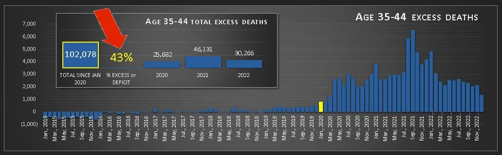
I added the percentage increase in deaths to the summary for each age group, and realized something disturbing: excess deaths in the 35-44 year age group were a stunning 43% higher than expected from 2020 thru 2022. In second and third place were the 25-34 year age group at 32% excess deaths, and the 65-74 year age group with 30% (see details and sources here). Overall, there were 21% more deaths than expected from 2020-2022.
How I calculated excess deaths, and why
I used the 5-year average from 2015 thru 2019 to calculate the number of deaths expected each month in each age group from 2020 thru 2022. Then I subtracted the expected number of deaths from the actual number of deaths to find the excess or deficit.
There’s a reason I calculated excess deaths using the 2015-2019 average, instead of a rolling 5 year average (in which the expected number of deaths is calculated by averaging the number of deaths that month over the previous 5 years): because in order to monitor when or if the explosion of deaths that began in 2020 returns to normal, you have to compare deaths to normal numbers, and 2015-2019 is the last 5 years of normal numbers we have.
If you use a rolling 5-year average to calculate excess deaths, it automatically normalizes even a huge increase in deaths in a short period of time, by integrating the higher death rates into the average (or expected) number of deaths. This chart illustrates what happens—it compares excess deaths measured using the 5-year average from 2015-2019 (in green), and measured using a rolling 5-year average (in blue).

See Note 1 for a data table.
In 2020, the lines are identical, since the previous 5 years was 2015-2019. But in 2021, excess deaths measured using the rolling average start to fall, and in 2022, after 2 years of record high deaths have been incorporated into the average, they decline even more. In 2023, the rolling 5-year average will include 3 years of record high deaths—which will effectively normalize a much higher rate of death.
NOTE: This normalizing effect could be minimized by using a 10-year rolling average instead of 5 years.
See Note 2 for a data table. See Note 10 on the CVax Risk page for the source of this data.
Of course, the rolling average is very useful in some situations—just not this one—not if you want to see when or if the sudden explosion of deaths in 2020 returns to normal. To do that, you need to compare current numbers to normal, pre-explosion numbers.
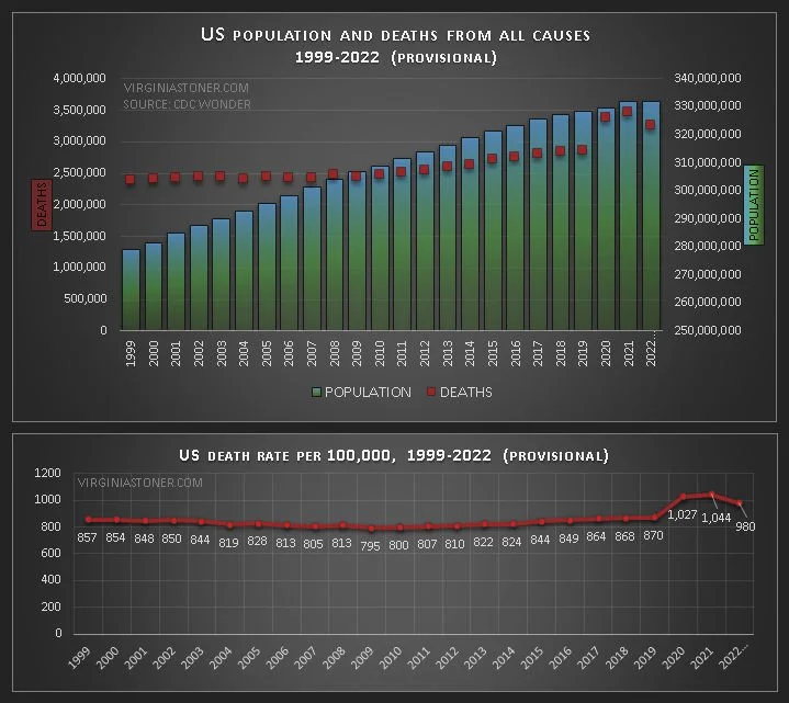
Yes, those numbers may have increased a bit on their own due to increased population or chance, but the numbers we’re talking about are way outside the realm of “a bit,” as you can see in this chart of US population and deaths.
The increase in death rate that peaked in 2021 was huge and unprecedented—in a sane world, it would be the media story of the century, with scientists scrambling 24/7 for answers. In our cartoon world, we pretend the extra deaths didn’t happen, or don’t matter—because anything is possible in cartoons.
***
NOTES
1) Data table comparing 5-year average from 2015-2019 to 5-year rolling average.

2) Data table for US population, deaths and death rate.
